Portfolio
Writing product emails
In this video, I am going through my process of writing product emails (not marketing emails) as a UX Writer.
Topics covered:
- What are product emails?
- Subject line
- Preheaders
- Body
- Alt-text
- ARIA labels
- Email size

Fast.com content redesign case study
In this case study, I have described my process of designing the Fast.com site. Through a mix of user interviews, iterative writing, and testing, my goal was to make the site simpler and easier even for non-technical users.
Note: I have zero knowledge of the business and user problems that the organization was trying to solve and what might have influenced their content decisions. So, please consider the case study as my humble opinion.
Read Fast.com content redesign case study
Email preheaders
Oftentimes, preheaders in product emails are overlooked or written by the developers or left empty. The preheader text displays in the inbox after the subject line to give the reader a better idea of whether or not to open an email. By including preheader text in the email header, we can use the opportunity to further entice your users into opening your email.

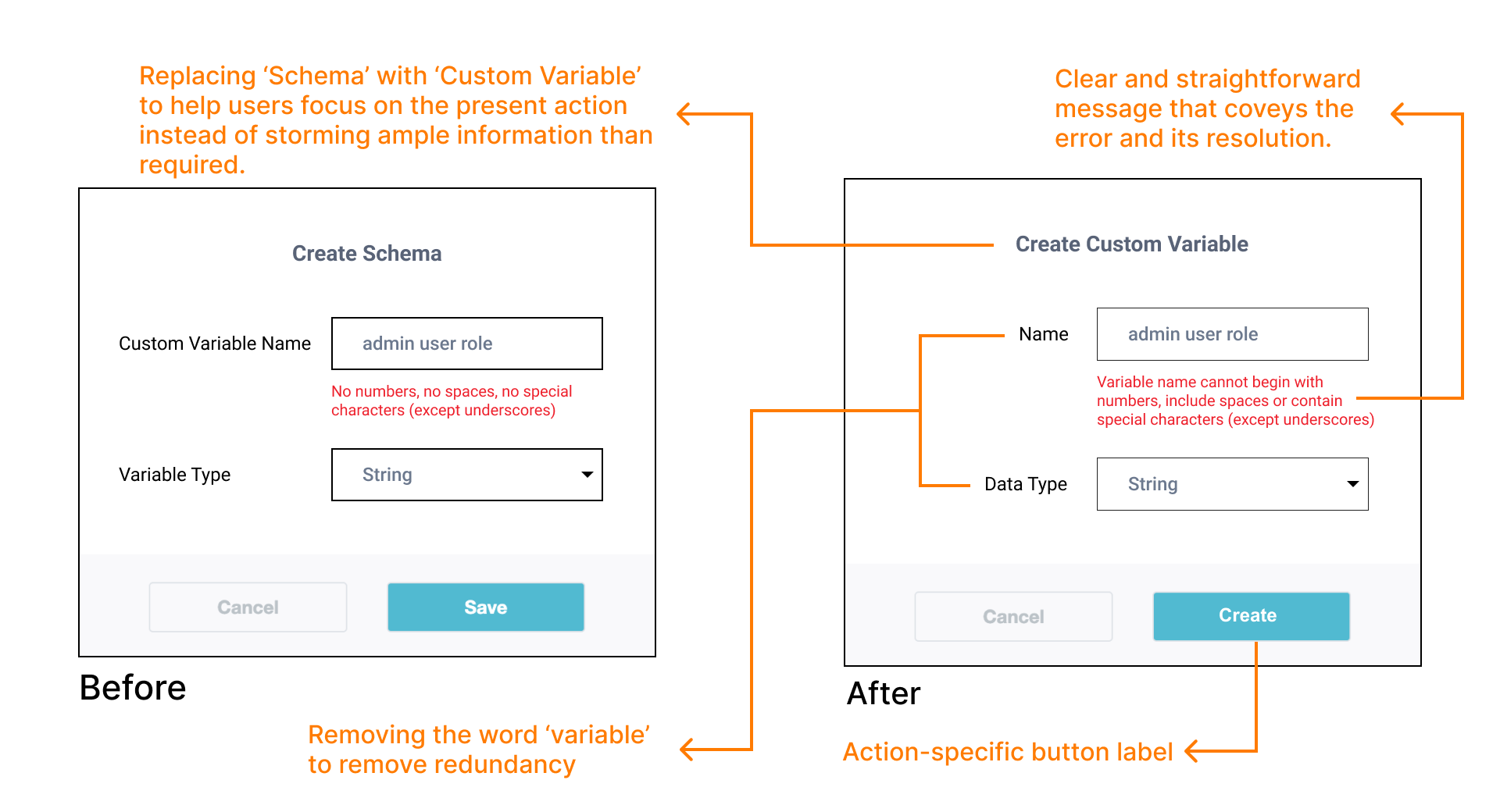
Feature and page description
The descriptions used throughout this page had several inconsistencies and didn’t convey the capabilities of the feature. These inconsistencies impacted the feature adoption.

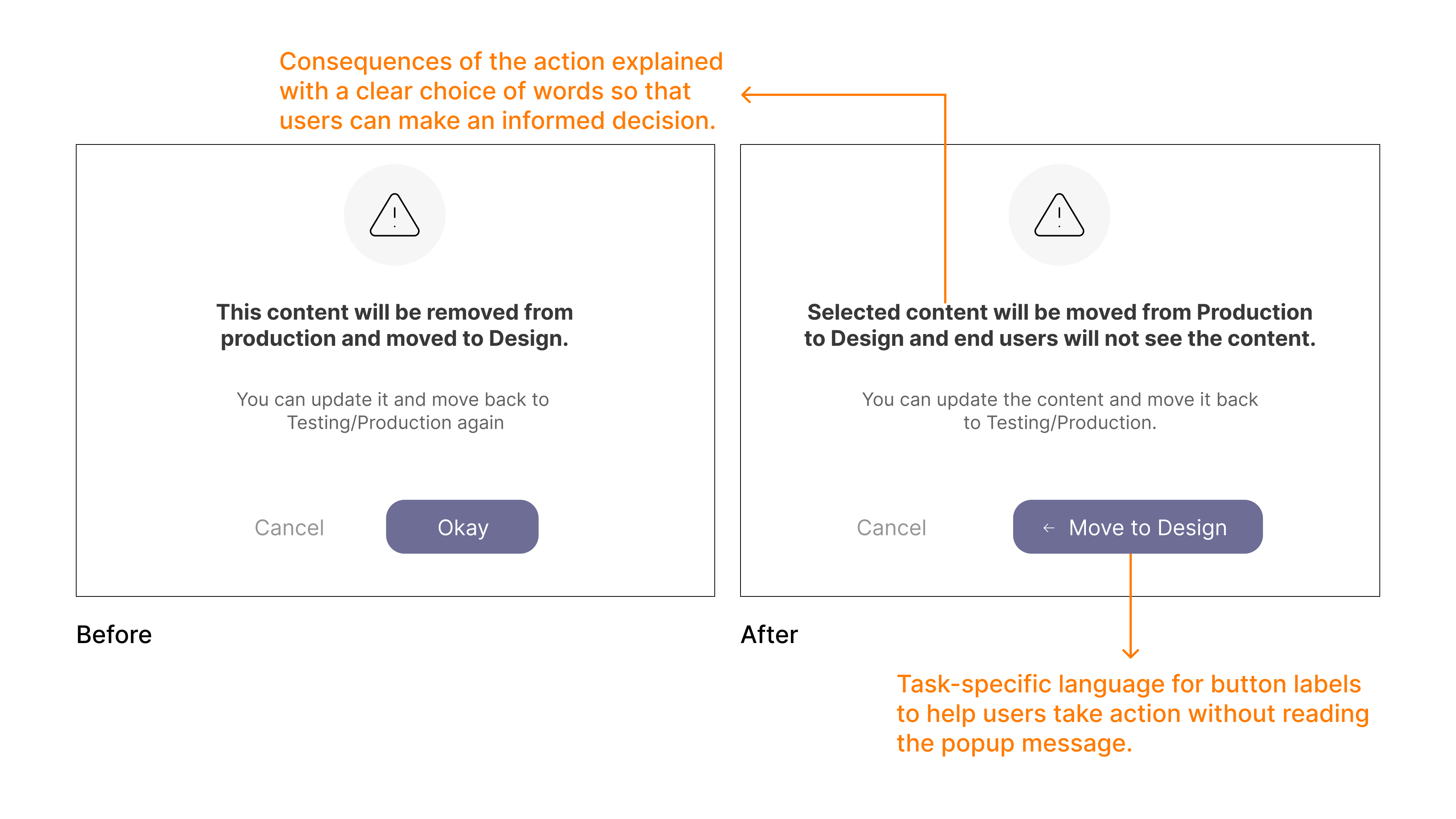
Confirmation popup
Though I detest confirmation popups I do believe in using them effectively based on severity and complexity of user action. In this action, I intend to emphasize on two crucial consequences, 1. The content is moving from one stage to other 2. At the same time, it is impacting the end users
Snackbar success message
To design an effective snackbar, I decided to convey the action status as early as possible in the sentence. Since snackbars appear only for a couple of seconds, I started the message with the verb that can convey the status.

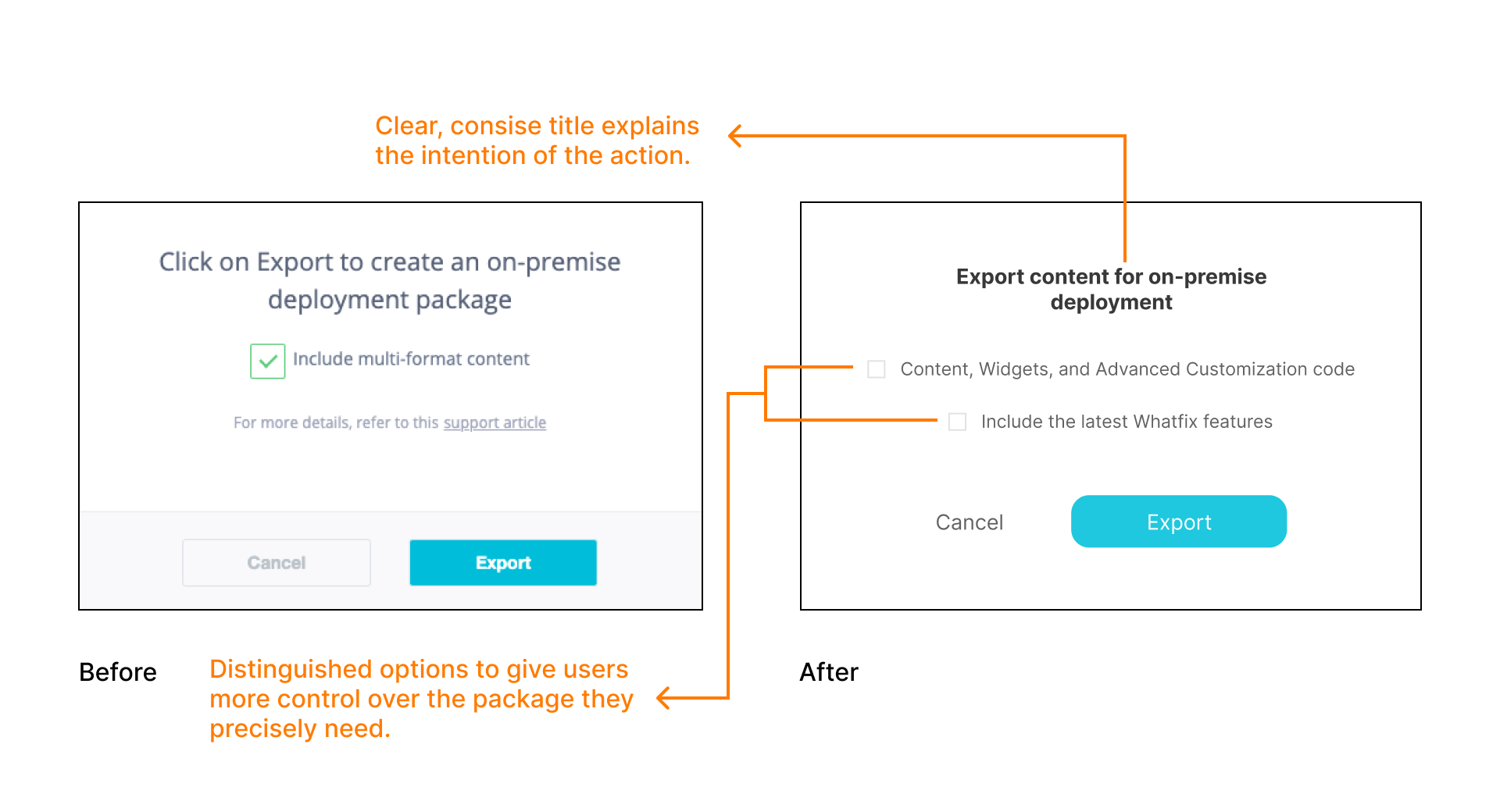
Feature explanation and confirmation popup
When we first introduced on-premise deployment for enterprise customers, I wanted to explain the feature in as few words as possible. After trying out a few versions and research we landed on this one. Though the copy isn’t as simple as I wanted, it was necessary to include technical terms to get the point across.
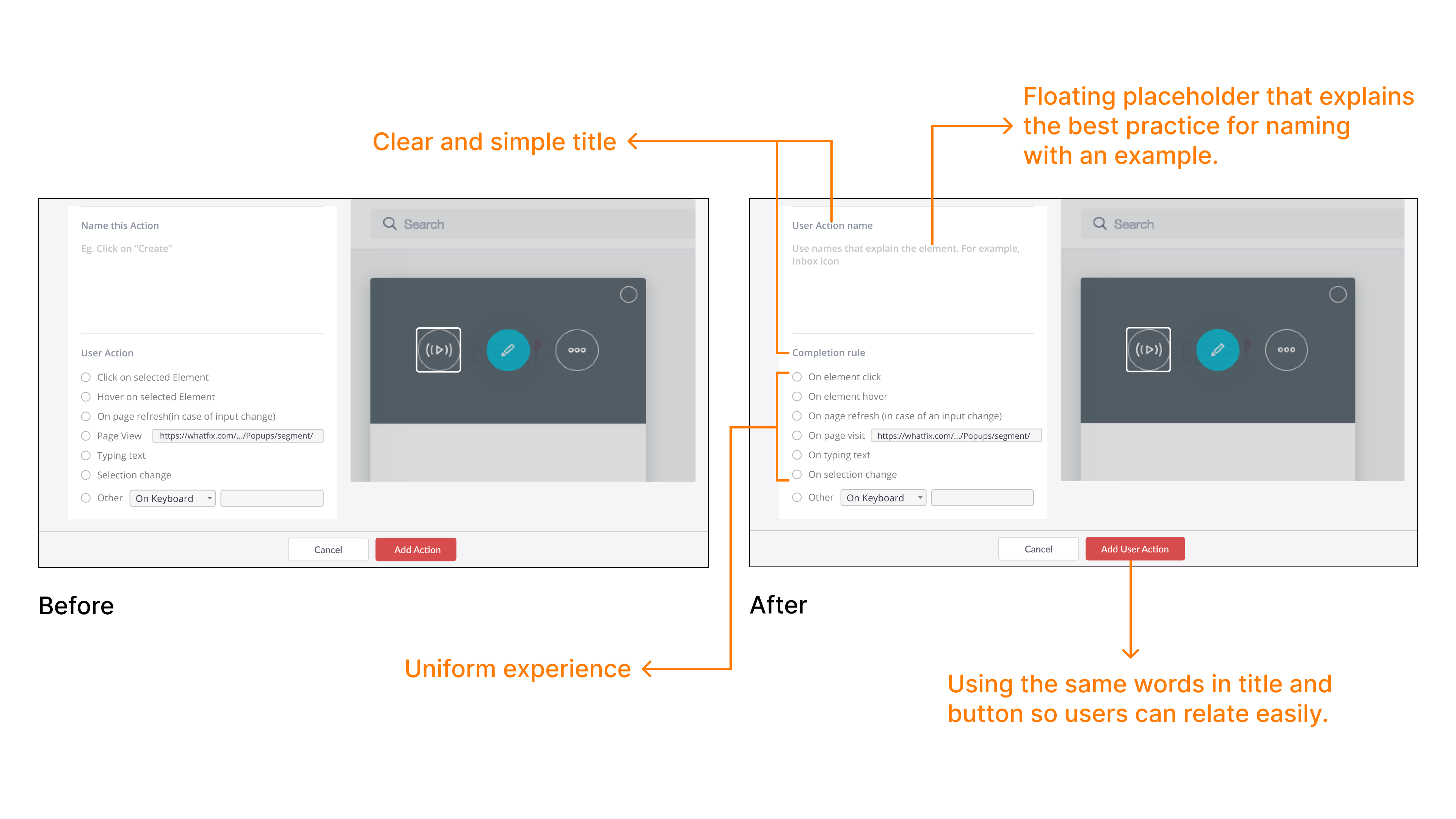
Continuity using words
To ensure continuity, I used the same word “User Action” that led to the creation process in the first place.
Error message
Feedback from customers showed that they were not able to resolve their mistake using the error message. The new error message involved collaborating with the developers and a complete rework.